
How to Design Promotional Handouts That Grab Attention
Let’s face it — in a world of endless scrolling and flashy digital ads, getting someone to stop, notice, and actually engage with your marketing material feels harder than ever. But there’s one old-school tactic that still works wonders when done right: promotional handouts.
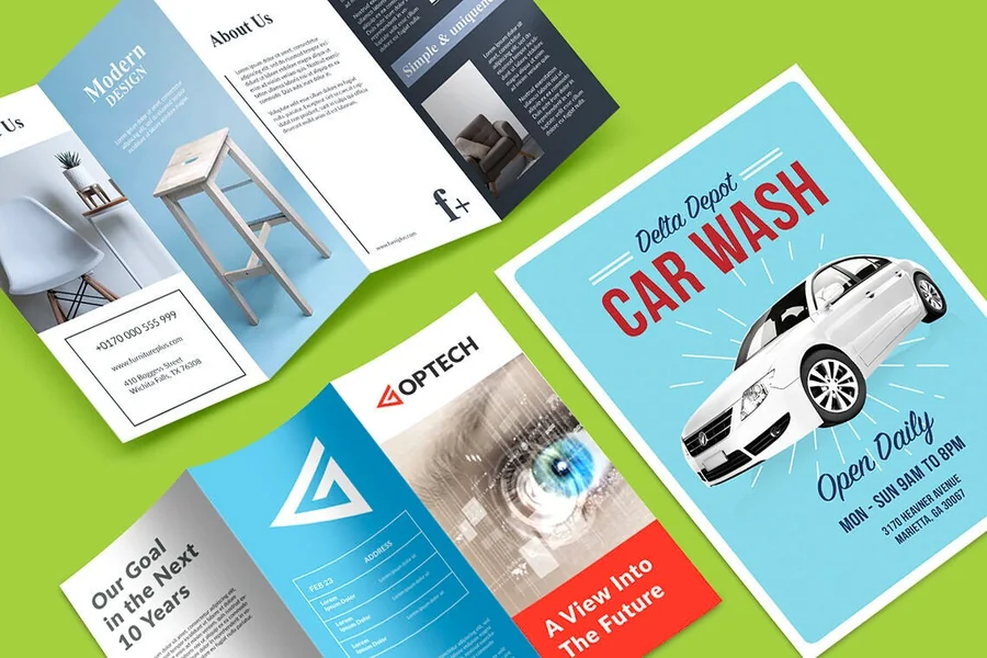
Yes, we’re talking about those physical flyers, brochures, and cards that you can hand out at events, trade shows, or even local cafés. They’re tactile, personal, and — when designed thoughtfully — surprisingly powerful at catching attention and leaving a lasting impression.
But here’s the thing: not all handouts are created equal. A bland flyer with too much text or poor color choices will likely end up in the nearest recycling bin. The goal is to design something that doesn’t just inform, but intrigues — something that makes people pause for a moment and say, “Wow, this looks interesting!”
So, how do you create promotional handouts that actually grab attention and make people remember you? Let’s walk through it together.
Start With a Clear Purpose
Before diving into design tools or color palettes, take a step back and ask: What’s the purpose of this handout?
Is it to announce a new product? Promote an event? Offer a special discount? Or simply raise brand awareness?
Your answer will influence everything — from the layout and tone of your message to the imagery and call-to-action (CTA).
For example:
- If you’re promoting a new restaurant, your handout might emphasize mouthwatering visuals and a bold “Grand Opening” date.
- If you’re advertising a professional service, you might highlight credibility, testimonials, and contact details.
When your purpose is clear, your design decisions become much easier — and your message more focused.
Understand Your Audience
Design is communication. And effective communication always starts with understanding who you’re talking to.
Think about your target audience’s preferences, habits, and expectations:
- Are they young, tech-savvy professionals? Go for sleek, minimalistic designs with strong typography.
- Are they families? Use bright colors, playful fonts, and warm imagery.
- Are they corporate clients? Stick to clean lines, muted tones, and a professional layout.
Once you know who you’re designing for, you can shape your content and visual tone to resonate with them. Because the most visually stunning handout means nothing if it doesn’t connect with your audience on an emotional level.
Keep It Simple and Focused
Ever seen a flyer stuffed with so much text and imagery that you didn’t know where to look first? That’s a common mistake.
The truth is, less is more. People typically spend just a few seconds glancing at a flyer before deciding whether it’s worth reading. So, focus on one main message — not five.
A few golden rules:
- Limit your text to what’s truly essential.
- Use bullet points for readability.
- Make your CTA clear and actionable — “Call today,” “Visit our website,” or “Join us this Saturday.”
- Leave white space around your elements so the design can “breathe.”
A clean layout not only looks more professional but also makes your message instantly digestible.
Choose Colors That Reflect Your Brand
Color is one of the fastest ways to grab attention — and influence emotion.
If your brand already has established colors, stick with them for consistency. But don’t be afraid to experiment with complementary tones to make key elements pop.
For instance:
- Red evokes excitement and urgency (great for limited-time offers).
- Blue conveys trust and professionalism.
- Green suggests growth, nature, and balance.
- Yellow grabs attention and sparks optimism.
Just remember to keep it balanced. Too many bright or clashing colors can overwhelm the viewer. A well-chosen palette — usually two or three main colors — will help create harmony and visual impact.
Use Images That Tell a Story
A compelling image can speak louder than paragraphs of text. Choose visuals that capture the spirit of your message — whether it’s a smiling customer, a product in action, or an aspirational lifestyle shot.
High-quality, relevant imagery can make your handout instantly more engaging. If you don’t have professional photos, you can find great royalty-free images on platforms like Unsplash or Adobe Stock.
Better yet, personalize your visuals. Include real people from your team or event photos to add authenticity — because real moments resonate more than stock photos ever could.
Typography: The Unsung Hero of Design
Typography does more than display text; it sets the tone.
Imagine using Comic Sans for a law firm brochure — it instantly changes the perceived professionalism, right? The fonts you choose can make or break your design’s credibility.
Here’s a good rule of thumb:
- Stick with two fonts max — one for headings, one for body text.
- Make sure your font size is legible from a distance.
- Use contrast (like bold or italics) sparingly to highlight key points.
Good typography subtly guides the reader through your content without overwhelming them.
Embrace Modern Tools to Simplify Design
You don’t have to be a professional graphic designer to create stunning promotional handouts. Today’s design tools make the process incredibly accessible — even for beginners.
Platforms like Adobe Express, for instance, offer an easy way to start from ready-made layouts and customize them to suit your brand. You can browse printable flyers using Adobe Express to find templates tailored for different industries, events, or promotional styles. From there, it’s as simple as dragging in your images, adjusting your text, and experimenting with color schemes.
The beauty of using templates is that they give you a professional foundation — so instead of starting from scratch, you can focus on the creative details that make your handout unique.
Add an Element of Surprise
People love surprises — even small ones. Consider including an unexpected design feature that grabs attention and sparks curiosity.
It could be:
- A witty headline or clever wordplay
- A QR code linking to a fun video or landing page
- A cut-out section or unique fold
- A textured finish or glossy element
These little touches not only make your handout stand out but also increase the chances that people will engage with it — and remember your brand later.
Test Before Printing
Before hitting “Print,” take time to review your design carefully. Check for typos, color accuracy, and layout balance. Print a test copy and hold it in your hands — does it look and feel like you imagined?
Sometimes what appears perfect on-screen doesn’t translate as well on paper. Testing helps catch small issues before they turn into costly mistakes.
Also, consider your paper choice. A thick matte or glossy finish can elevate the look and feel of your flyer, instantly giving it a more premium impression.
Distribute Strategically
Design is only half the battle — distribution matters just as much.
Think about where your target audience spends time. If you’re promoting a local event, distribute flyers in nearby coffee shops, gyms, or community centers. If it’s a professional service, leave them at coworking spaces or networking meetups.
You can even include your handouts in customer orders, gift bags, or mailers. The key is to meet your audience where they already are — not expect them to come to you.
Keep Iterating
Finally, remember that design is an evolving process. Pay attention to feedback and track results. Which handouts get the most responses? Which designs spark conversation or conversions?
Use these insights to refine your next campaign. Over time, you’ll develop an intuitive sense for what your audience loves — and what makes them take action.
A Fresh Perspective
Promotional handouts may seem simple, but when done right, they’re a secret weapon for connection. They’re not just pieces of paper — they’re touchpoints that represent your brand’s story, values, and personality.
By blending thoughtful design, storytelling, and modern tools, you can create handouts that not only capture attention but also linger in memory long after the event is over.
Because at the end of the day, great design isn’t just about looking good — it’s about feeling right to the people who matter most: your audience.